In the world of business, where first impressions matter, signage is both an art and a science. Crafting a sign that not only captures attention but also communicates a brand’s message requires a delicate balance of creativity and strategy. Let’s unravel the secrets behind eye-catching displays by exploring the artful design principles that turn ordinary signs into visual masterpieces.
Understanding the Basics: The Foundations of Signage Design
At the heart of any eye-catching display lies a strong foundation of design basics. This includes choosing the right colors, fonts, and layout. Colors evoke emotions, fonts convey personality, and the layout guides the eyes. A well-designed sign ensures that these elements harmonize to create a visually appealing and coherent message.
Signage Company in Delhi: Blending Cultural Sensitivity with Design Expertise
In the bustling metropolis of Delhi, signage design takes on a unique flavor. A signage company in Delhi understands the local culture, preferences, and the vibrant spirit of the community. This local touch brings an extra layer of connection to the design, ensuring that the signs resonate with the people they aim to attract.
Keep It Simple: The Power of Minimalism
Ever heard the phrase “less is more”? In signage design, it holds true. A cluttered sign overwhelms the viewer, making it difficult to absorb the message. The art of simplicity lies in conveying essential information with clarity. Minimalistic designs not only look modern and sophisticated but also make a more significant impact.
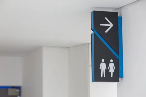
Contrast for Visibility: Making Elements Stand Out
Contrast is a key player in signage design. It involves using differences in color, size, and font to make elements stand out. For example, dark text on a light background or vice versa ensures readability. A good use of contrast guides the viewer’s eyes to the most crucial information, enhancing the effectiveness of the sign.
Choosing Fonts Wisely: Legibility Matters
The choice of fonts may seem like a small detail, but it can make a big difference. Fancy, intricate fonts might look appealing, but if they sacrifice legibility, they defeat the purpose. Clean, simple fonts are often the best choice for ensuring that the message is easily readable, especially from a distance.
Hierarchy of Information: Guiding the Viewer’s Attention
Every sign has a hierarchy of information – the order in which the viewer should absorb details. Designing with hierarchy in mind ensures that the most critical information gets noticed first. Whether it’s a headline, a subheading, or a call-to-action, a well-structured hierarchy guides the viewer’s attention seamlessly.
The Psychology of Colors: Eliciting Emotions and Responses
Colors are powerful communicators. Each color evokes specific emotions and responses. For example, red can signify urgency or excitement, while blue may convey trust and reliability. Understanding the psychology of colors allows designers to choose hues that align with the intended message and resonate with the target audience.
Size and Scale: Fitting Signage to the Environment
The size and scale of a sign matter in creating a visual impact. A small sign in a large space may go unnoticed, while an oversized sign in a confined area might be overwhelming. The art lies in finding the right balance – ensuring that the size and scale of the sign complement the environment and attract attention without dominating the space.
Consistency Across Elements: Creating a Unified Visual Language
Consistency is the glue that holds a sign’s design together. From colors to fonts and imagery, maintaining consistency across elements creates a unified visual language. This coherence reinforces brand identity and makes the sign easily recognizable. It’s like speaking a consistent visual dialect that customers come to associate with a particular brand.
Legible from a Distance: Designing for Visibility
Effective signs are designed with visibility in mind, especially from a distance. This is crucial for outdoor signs or those placed in large spaces. The size of text, choice of fonts, and contrast play significant roles in ensuring that the sign remains legible even when viewed from afar. A well-designed sign doesn’t just capture attention; it maintains it.
Balance and Symmetry: Creating Visual Harmony
Balance and symmetry bring a sense of harmony to signage design. A well-balanced sign distributes visual elements evenly, preventing a lopsided or chaotic appearance. Symmetry, whether it’s perfect or asymmetrical, adds a touch of order and makes the sign more visually pleasing. This visual harmony contributes to the overall appeal of the display.
Test for Effectiveness: Getting Feedback Before Finalizing
Before finalizing a design, it’s essential to gather feedback. Testing the sign with a diverse group of people helps identify potential issues and ensures that the message is universally understood. This step in the design process is the bridge between the science of principles and the art of real-world effectiveness.
Adapting to the Environment: Context Matters
Effective signage is not a one-size-fits-all endeavor. The design should consider the environment where the sign will be placed. A sign in a bustling market may have different design requirements than one in a serene park. Adapting the design to the context ensures that the sign blends seamlessly with its surroundings while still standing out.
Conclusion: The Masterful Blend of Art and Science
In conclusion, effective signage is a masterful blend of art and science. Design principles form the scientific framework, ensuring legibility, visibility, and coherence. The artistry comes in crafting a visually appealing and emotionally resonant display. In Delhi, where the local culture adds a unique flavor, a signage company in Delhi becomes the orchestrator, infusing creativity with cultural understanding. As businesses strive to make their mark in the visual landscape, the art and science of signage stand as the beacon, guiding them toward eye-catching displays that captivate, communicate, and leave a lasting impression.